

Technical Documentation
Thank you for your interest in the technical details of Citizen’s Foreign FiX. As you know, there is a great deal of information presented in the analytics section and not all of it is self-evident. In this brief document, we go through each of the sections and explain how to interpret the data. Having a working familiarity with the tables allows you to more rapidly assess the market implications.
Percentage Returns & Pivot Points
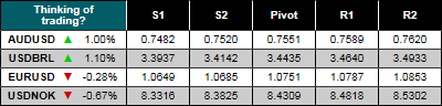 Each morning, we look at the percentage change in the currency. Importantly, this is not the same as how the currency is quoted. In this example, the EURUSD down arrow indicates that the Euro is lower by 0.28% against the US Dollar. Meanwhile, a similar quote in USDNOK with a down arrow of 0.67% means that the Krone is also higher against the US Dollar. In terms of quoting convention, this would imply that EURUSD is higher reflecting Euro strength, but in the case of USDNOK, the quote would be lower as the Krone has gained while the Dollar has declined.
Pivot points are formula-determined levels that are based on the prior day’s price action. They are one of the older intraday technical indicators as the calculation is very simple and was easy to use before computers dominated activity. Today, their use remains popular and they continue to do a remarkable job of defining intraday levels. While not perfect, they are useful as a rough level of movement potential as each pivot point has symmetrical bands on either side represented by:
- Secondary Support / S2
- Primary Support / S1
- The Pivot
- Primary Resistance / R1
- Secondary Resistance / R2
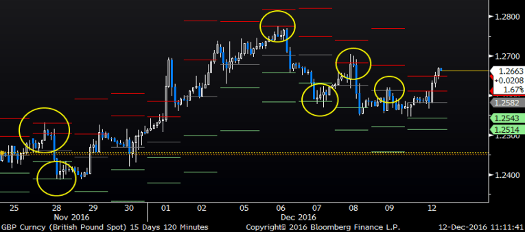
The chart to the right is a month of GBPUSD and the number of times that the Pivots define intraday levels is clear.
Annualized Cost of Forward Points
Forward points are quoted for each tenor as a measure of the interest rate differential that exists between the two currencies adjusted for the basis to reflect supply and demand. However, these forward points are expressed in counter-currency terms and not as an annualized figure. It can be somewhat deceptive to see rising forward points as the tenor increases, but this is not always the same thing as a rising differential from spot. In the current market where global central banks are maintaining tight control over the front end of the yield curve, many forward point curves exhibit significant inflections and when these points are annualized via the exponential value raised to the power of time, the differential in forward premium or discount becomes quite visible.
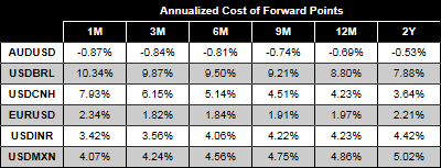 Consider the following forward curves illustrated in the table to the right. There are dramatic differences in the percentage cost between the tenors even for the same currency. Can this difference be monetized? For example, assume a corporate client is long EUR / short USD and needs to hedge a rolling fair value exposure on the balance sheet. Euro forward points are positive implying a value to sell Euro forward. However, if the holder is indifferent to rolling a one-month tenor or a three-month tenor, on an annualized basis the pick-up in value for hedging via the one-month tenor is far larger.
We provide these indicative mid-market levels as a way for clients to evaluate the forward premium or discount on a common basis of comparison. The table is read as the spot is quoted:
- EUR & AUD are quoted in USD per currency, but Euro points are positive while AUD points are negative. Depending on the direction of your exposure, these are either a cost or a benefit. Long Euro holders needing to sell earn a forward premium while short Euro buyers need to pay.
- For the other pairs quoted in currency per USD, the points are also represented in the same quotation terms. USDMXN points are a premium. If you are long MXN and need to buy USD, the forward points are a cost. If you need to sell USD and buy Pesos, the forward points are a benefit.
Heat Maps
The FiX relies heavily on HEAT MAPS as a way to easily identify whether prices are trading rich or cheap over a certain period of analysis. This valuation measure is known as the Z score and it is not only easy to calculate, it is also widely accepted in the market as a measure of how far today’s price deviates from the mean on a volatility adjusted basis. In mathematical terms, the Z score is defined as:
Z = ((Price-Average) / Standard Deviation)
The first terms simply define how far today’s price is from the average price that has prevailed over a period. However, it does not answer the question of whether the magnitude of that move is significant or not. By dividing the first term by the standard deviation of the price over the same period, we can evaluate the magnitude of the move. For example, if today’s price was 100pts over the average, but the standard deviation was 150pts, it can be inferred that the deviation is not uncommon. However, if the standard deviation was only 50pts, a 100pt deviation is much more material.
 To standardize our analysis over all pairs, we use the following Z-score filters:
- Cheap – Z score lower than -3SD
- Cheap Moderate – Z score between -3SD and -1.5SD
- Fair Value – Z score between -1.5SD and +1.5SD
- Rich Moderate – Z score between +1.5SD and +3.0SD
- Rich – Z score greater than 3SD
Please note that the terms “Cheap”, “Fair Value” and “Rich” do not imply a recommendation to buy or sell based simply on the Z-score valuation. Rather, within the confines of the overall market, these scores are instead designed to identify when trends are changing rather than being an absolute value reference.
We also calculate Z scores for two different periods and for each currency variable, we show the three month and one year scores on the HEAT MAP. The reason for showing both is to illustrate both short-term disruptions and long-term change in trend. For example, an unusually high or low Z score in the three month tenor while the one year Z score is closer to fair value might indicate a response to market stress or a period of unusual data or volatility. An unusually high or low Z score in the one year often requires a significantly larger move and is indicative of large valuation trend changes in the market. For each variable analyzed, we subdivide each box into two sections which represent the 3M & 1Y tenor.
Forward Points
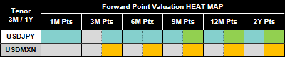 Let’s take a look at some examples in two pairs that are producing both extreme and moderate valuations over the forward point curve. In the case of USDJPY, forward points are almost universally “Cheap Moderate” over the last three months. While many of these Z scores are similar over a one year horizon, if we look at the longer dates, these forward points are “Cheap”.
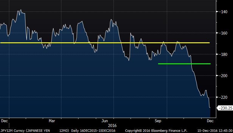 Looking at the price data we can see why the results show what they do. The graph to the right is that of one year forward points in USDJPY; the YELLOW line is the average value over the last year while the GREEN line is the average value over the last three months. Referencing the HEAT MAP above, we see 12M pts are currently “Cheap Moderate” as measured over the last three months. As evidenced in the chart, the last three months have been particularly volatile so that while the deviation between today’s level and the average is still large, divided by the standard deviation it is only “Cheap Moderate”. On the other hand, over the last year, forward points have been relatively stable implying lower volatility. The distance from today’s price and the average is slightly larger, but when divided by the lower standard deviation, the result is “Cheap” forward points. To reiterate, these values only reflect relative position. For clients who have to buy JPY / sell USD, the sharp move in points “to the left” is anything but cheap as it implies that the cost of hedging is rising to expensive levels.
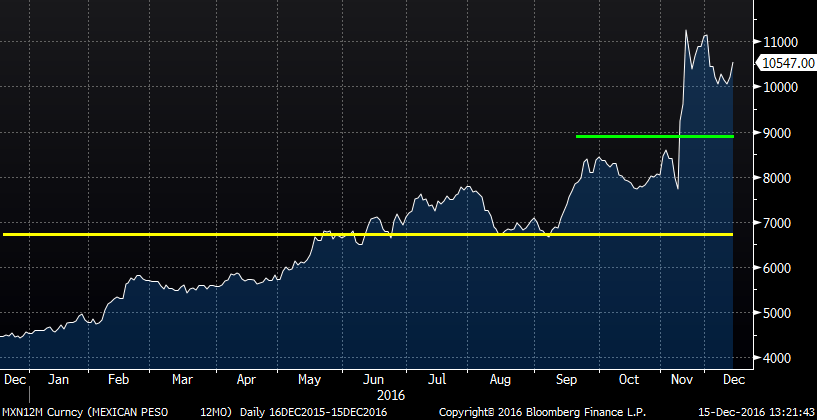 Another story exists in USDMXN one year forward points where the points are “Fair Value” over the entire curve in the last three months, but are “Moderate Rich” when measured over the last year. It is no surprise that the Peso saw an extraordinary amount of attention during the last US presidential election and both the currency and the forward points were exceptionally volatile during this period. When compared to the average level of the last three months, today’s value is not particularly far away while the volatility is quite high. As a result, the three month Z score is “Fair Value”. However, over the last year, one-year points have been far less volatile. When the difference between today’s value and the average is divided by this lower standard deviation, the results are “Moderate Rich”. Again, “Moderate Rich” only works for clients that are short USD / long MXN and have to hedge. For those who fund Mexican operations, the rise in forward points “to the right” represents a hedge cost benefit.
Implied Volatility
 We also apply the same HEAT MAP analysis to another important indicator of the FX market which is Implied Volatility. “Implied vol” is used in option pricing and it is the traded expectation for how volatile markets are expected to be over a given tenor. Implied volatility levels and prices are closely followed by market professionals as indicators of potential stress in the market. For corporate risk managers, they have the same function as well as to indicate how expensive or cheap the price of options which are used to hedge exposures. As purchased options provide risk managers with a defined amount of risk without any use of credit while maintaining any gains on the exposure from favorable movement in the underlying, they are considered the most attractive of all hedging instruments. Unfortunately, the use of an option requires a premium payment. For risk managers, buying options “Cheap” is a long-running objective. Conversely, there are many structured forward products that provide a combination of forward and some limited optionality that actually benefit from higher levels of implied vol. For these reasons, we also track the Z score over both a three and twelve month horizon.
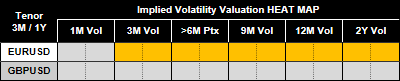
Looking at the HEAT MAP above, we see that while GBPUSD implied vols are “Fair Value” over all tenors of analysis and maturity, it is a different story in EURUSD where almost the entire vol curve is “Moderate Rich”. Are there any characteristics of the market that would support this? In the case of GBPUSD, the answer is easy once we look at the charts. Again using one year implied vol as our variable, the average of the last three months and the average of the last year are, coincidently, almost exactly on top of current prices. With such a small differential, it almost makes no difference what the standard deviation of the series is as the numerator is so small.
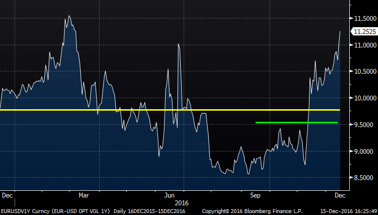 It is a different story in EURUSD where one year implied vols have surged following the last US presidential election and the broad US Dollar rally has been pressured to levels that have not traded in over a decade. Clearly the market’s expectation of movement and the demand for option protection has increased as option prices have rallied almost 30% since the period immediately prior to the election. Over both the three month period and the twelve month period, the difference between today’s price and the average is significant. However, it is also clear that volatility of the data series has also increased and this is likely what is keeping the Z score on “Moderate Rich”.
Going back to our reference that such valuation metrics can be confusing, the use of the HEAT MAP and Z scores for options relies on the type of hedge strategy being employed. For clients who only buy options, “Cheap” and “Rich” mean just what they imply; option prices will be less expensive under a “Cheap” Z score and more expensive when “Rich”. However, for other strategies, it is less clear. Popular option combinations such as zero cost collars have a different level of value. Popular structured forward trades actually benefit when implied vols are elevated. As such, Z scores need to be treated with a bit more caution as a measure of valuation and as more of an indicator as to levels of market stress and what strategies might be appropriate for the current market.
Seasonality Trends
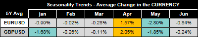 Here we deviate from the Z-score metric in terms of the values presented, but not in terms of the formatting that highlights significant movement potential. For each currency pair, we look out for the next six months and then provide the Average Monthly Move based on the last five years of data. The resulting percentage figure is always expressed in terms of the currency:
- For EUR, GBP, AUD & NZD – A positive number indicates that the average move over the prior five years is for a gain in the spot rate with the opposite also true.
- For all other pairs quoted with the US Dollar as the base – A positive number indicates that the currency has, on average, gained in that respective month over the last five years but that the move in the quoted pair will be lower. For example, a positive number for January in USDCAD indicates that the Canadian Dollar has appreciated on average over the last five January periods. Should this pattern repeat, the Canadian Dollar would be expected to appreciate with a corresponding decline in the quoted USDCAD spot rate.
The color in the Seasonality Trend matches the HEAT MAP, but it is scaled to match the currency. This allows us to highlight statistically (Z-score) large moves relative to each pair. A move in low volatility USD/China would be very different in percentage terms compared to a move in high volatility USD/South Africa. By scaling the color to match the Z-score of the relative move, we are able to separate the impact of individual pair movement characteristics.
Questions or Comments
Send us an email.